Onvio Documents

Client: Thomson Reuters
Project Type: UX Design & Research
Skills: Axure prototyping, brainstorming, collaboration, design specifications, mockups, project management, sketching, stakeholder interviews, and wireframing
What and Why
Part of my Firm Management focus included Onvio’s document-management application, called Onvio Documents.
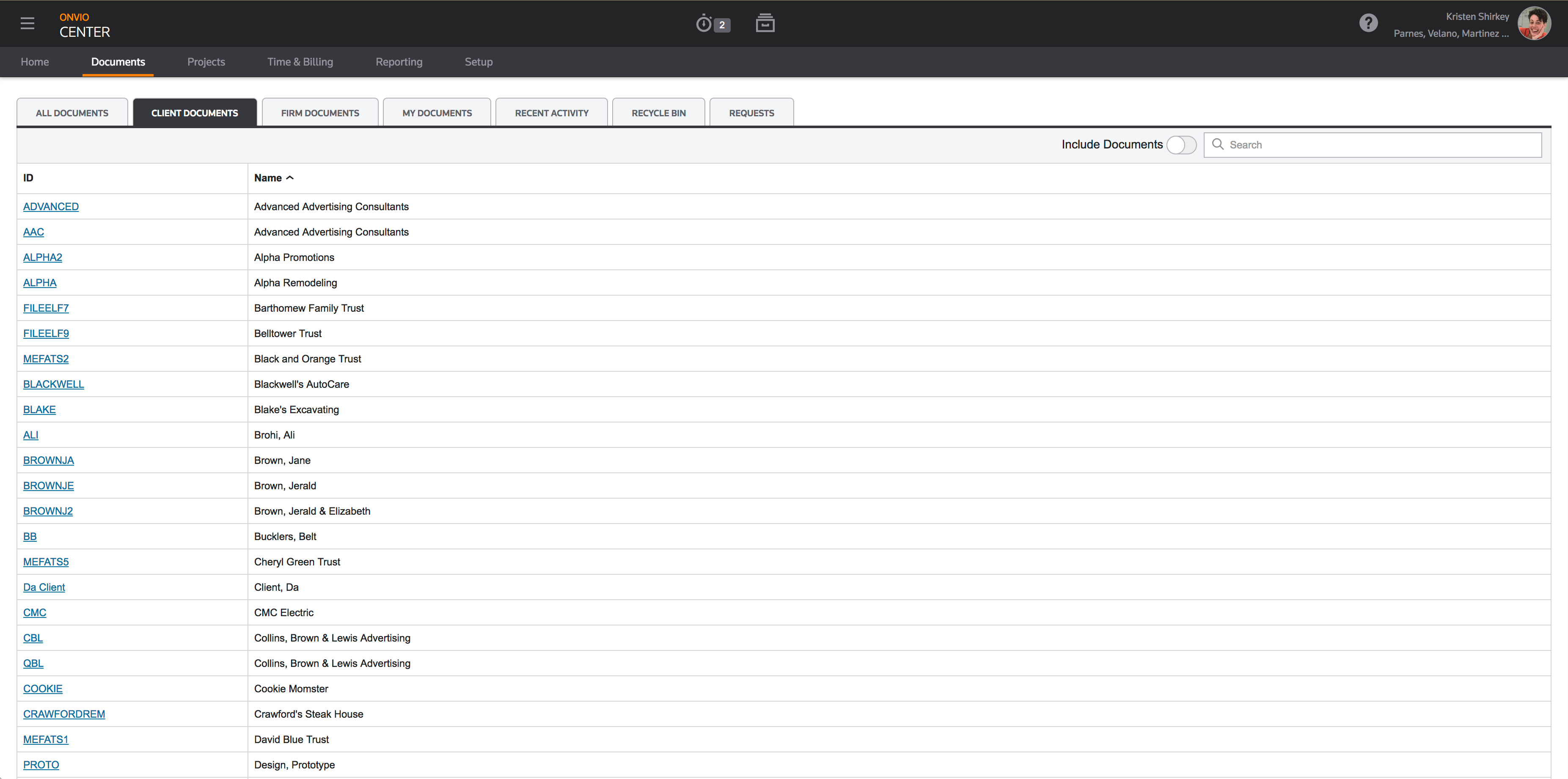
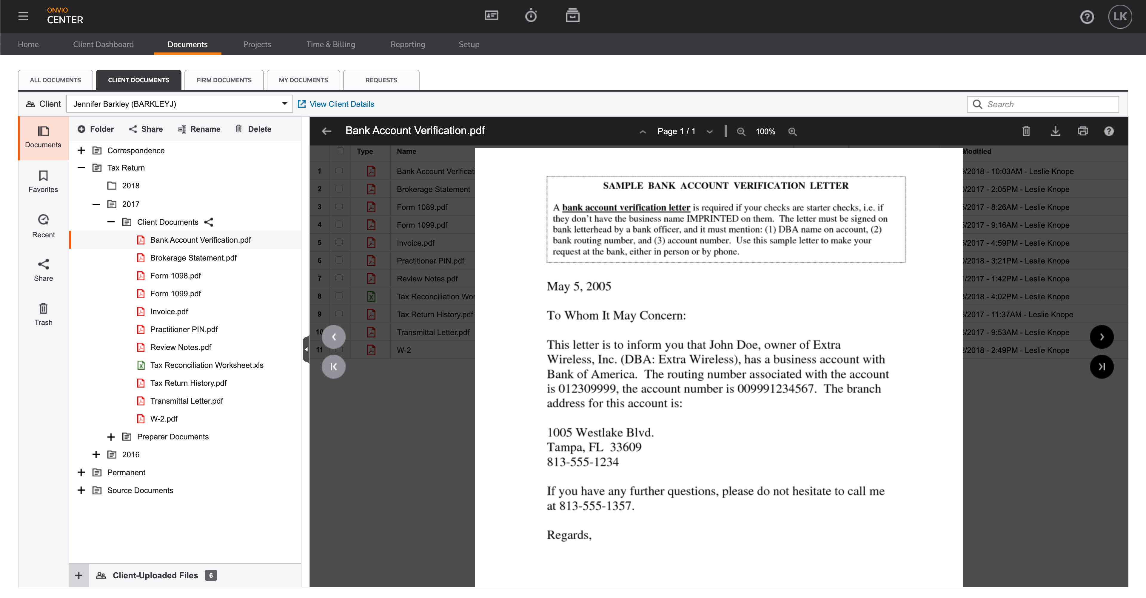
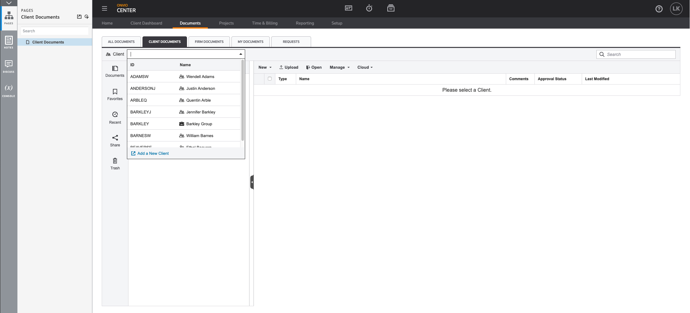
The navigation of the existing Onvio Documents was too cumbersome and was causing a 50% return rate of the Onvio suite. I was tasked with redesigning the Client Documents section and fixing the navigation issues.
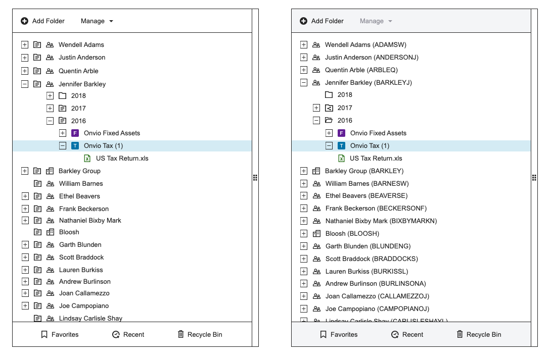
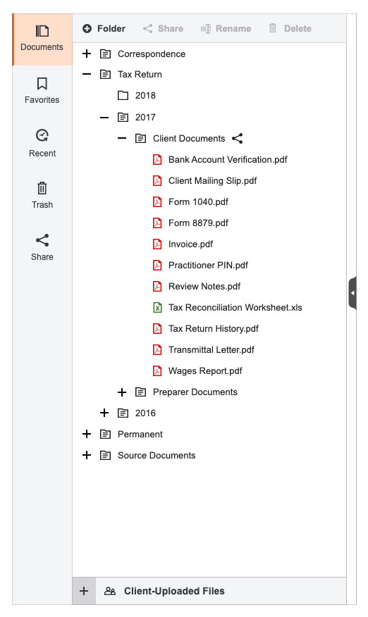
Redesign: Before & After
Problem
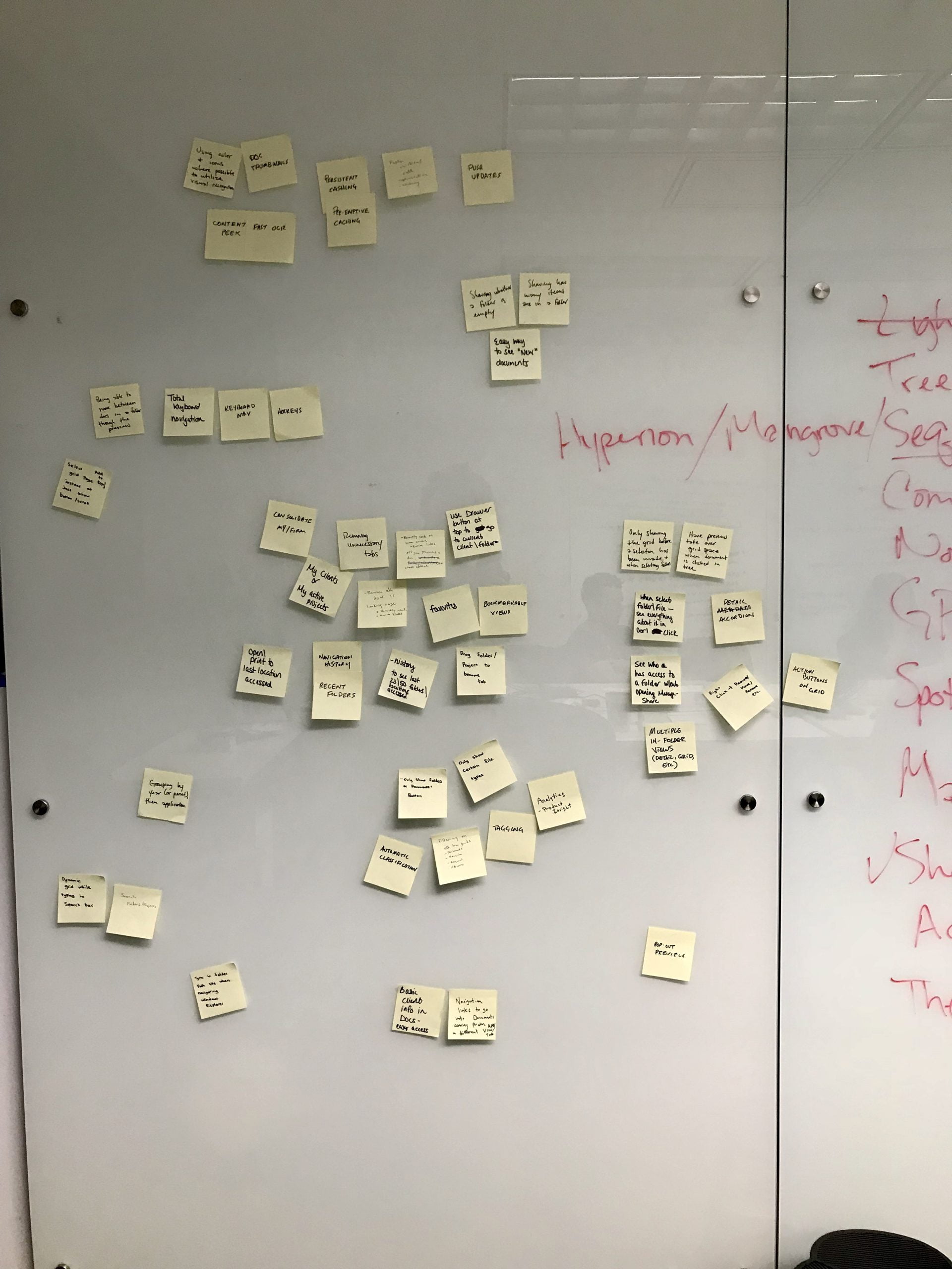
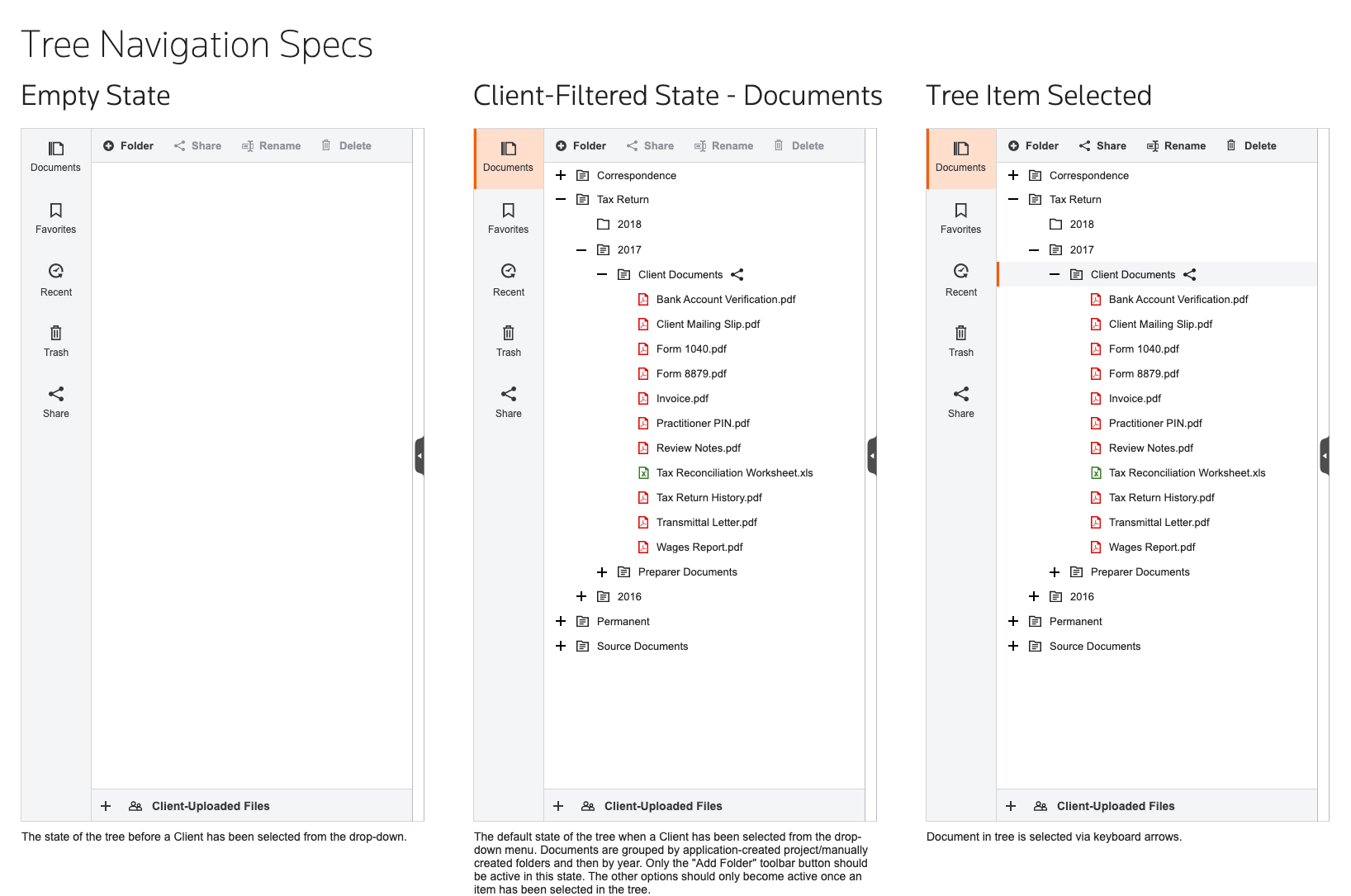
Previous research showed that navigation in the Documents application forced users to drill down too many levels to access previews. They wanted to have a tree navigation side-by-side with the document preview, similar to the functionality of the legacy desktop software.
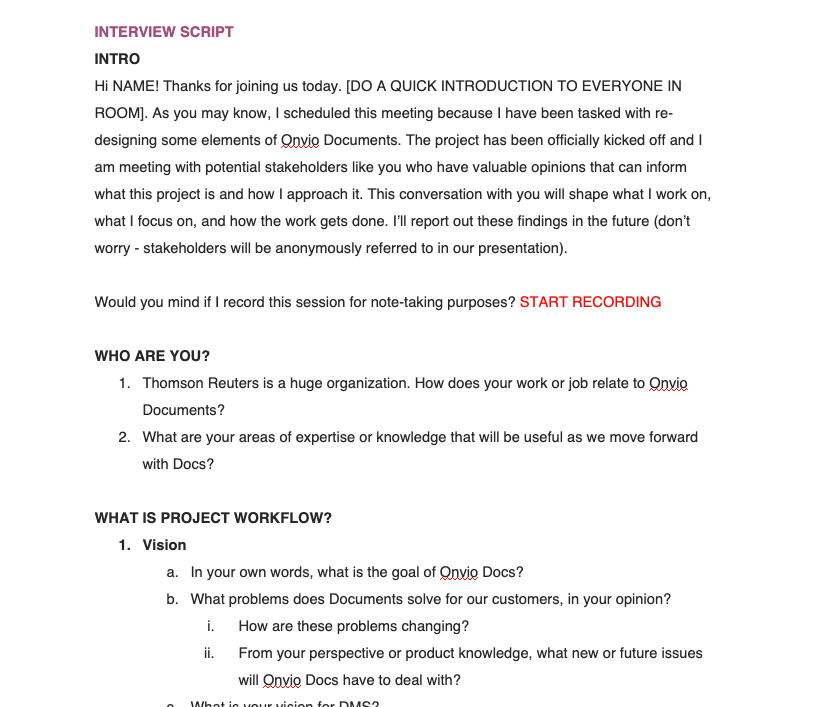
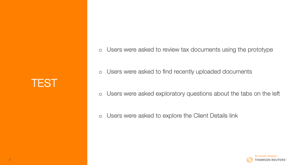
Approach
Struggles and Successes
This was the first time this particular development team worked with a UX Designer so some trust had to be built. I was embedded in the team and participating in most of their ceremonies. By the end of the project, I felt like an integral part of the team.
This was my first completely independent project at TR so I had to learn what was most effective. This boosted my confidence as a designer.
Outcome
My designs were regularly described as clean and easy to use. I worked with our dedicated researcher to test my designs twice and they tested well both times. They were implemented on a feature-by-feature basis. The following quote is an example of some of the feedback from customers:
“This definitely will be of great help. The whole nesting of the folder and then not knowing what’s inside each folder, and if you have a file or not, was very time-consuming. Now, here, we can see as it opens, on one screen, without having to jump to another, see the breakdown of what’s nested inside that tax return file and be able to actually click and see it in the next screen, when it was modified, etc. This is a great feature.”

