App Banner Redesign

Client: Nordstrom
Project Type: UX Design
Skills: brainstorming, collaboration, competitive analysis, wireframing, high-fidelity mockups
What and Why
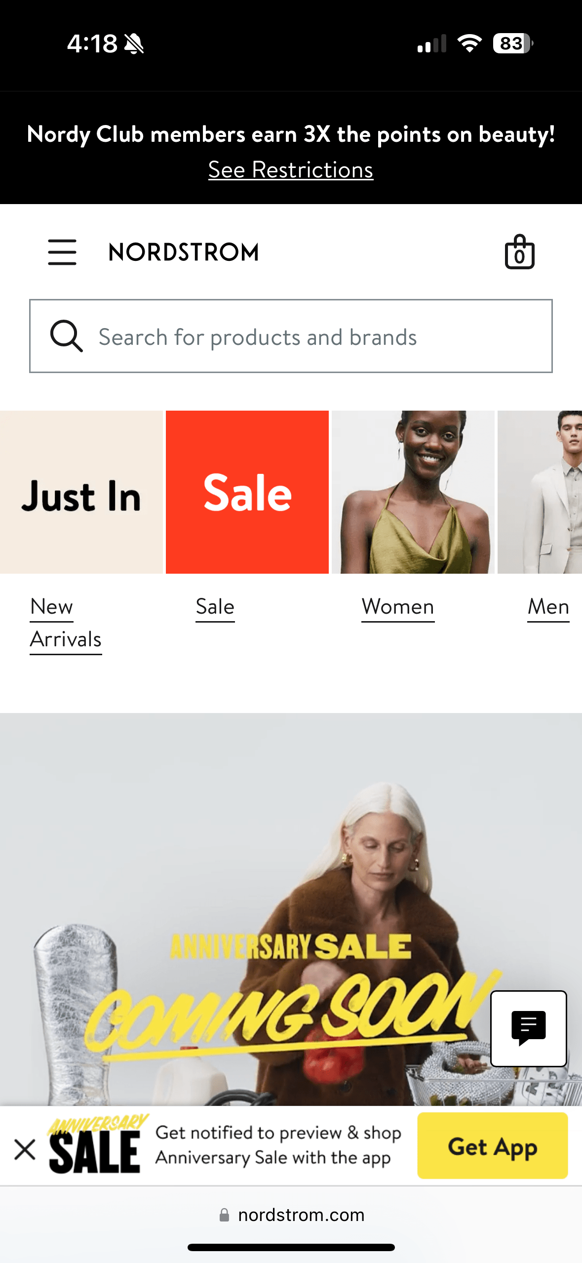
Nordstrom was trying to increase customer usage of the Nordstrom and Nordstrom Rack apps. The goal was to encourage visitors to the mobile site to either download or open the app as this resulted in a higher ROI for the company. A third party tool was used to replace the native app banners, since the messaging and design of these could not be customized.
Native App Banners
Problem
Nordstrom struggled to customize users’ experience on the mobile site, since the majority were not logged into their accounts. Users of the mobile site returned to the site less frequently and spent far less than app users. In the apps, Nordstrom is better able to: provide the high level of customization and customer service the brand is known for, increase customer retention, and increase conversion.
Approach
Hi-Fidelity Mockups
Once the stakeholders were on board with the different design choices for each page, I crafted high-fidelity mockups to show the team what the banners would look like in context. The Content Designer crafted messaging for each example to drive the appropriate behavior and align with each brand.
Struggles and Successes
The team had never worked with UX before so we had to provide a little extra context upfront about why they should trust our expertise. The timeline for this project was also quite condensed. We had a month to finalize the designs before the test was supposed to run.
Outcome
The launch was incredibly effective. There were 10 times the number of iOS app downloads for both Nordstrom and Rack, resulting in around 2500 new app downloads for each brand in only a week. The numbers for customers opening an already downloaded app from the mobile site were even higher.


